

RESEARCH TOPIC 2 - D.I.Y CULTURE

- Zines & Self Published Books
- Creative individuals
- Skateboarding
I want to focus my research on people who create things with their own two hands, whether this is carving a skateboard from a block of wood, or self-publishing a zine or book. As a creatively minded person I have always been infatuated with craft and making things myself, I believe there is a certain quality that is achieved that cannot be matched by other forms of mass produced media.
ZINES & SELF PUBLISHED BOOKS
I kicked off my second research topic by looking at zines. Due to their construction and function the majority of zines are created and published independently, making them fit the D.I.Y ethos perfectly.
WHAT IS A ZINE?

Short for “fanzine” or “magazine,” a zine is a noncommercial, often homemade, mini magazine. Zines are published in small print runs. One definition includes that a zine must have a circulation of under 5,000 copies and most zines are produced in editions of under 1,000. As zines are not typically made to turn a profit, they can often give expression to views and interests outside the cultural mainstream.
Link
Next, I used a book called 'Fanzines' by Teal Triggs, to research further into what makes a zine a zine.

HISTORY
WHAT IS A ZINE?
Short for “fanzine” or “magazine,” a zine is a noncommercial, often homemade, mini magazine. Zines are published in small print runs. One definition includes that a zine must have a circulation of under 5,000 copies and most zines are produced in editions of under 1,000. As zines are not typically made to turn a profit, they can often give expression to views and interests outside the cultural mainstream.
Link
Next, I used a book called 'Fanzines' by Teal Triggs, to research further into what makes a zine a zine.

- Often fly beneath the mainstream radar, independently published.
- Distribution takes place at zine fairs, personally, they can be sent through the post or be sold at independent music,art and book shops.
- Zines focus on communicating a message to a specific crowd of usually like-minded people, for example punk zines where often fanzines about punk bands for other punks to read.
- Print runs often vary and depend on the artist who produced the zine.
HISTORY
HOW TO MAKE YOUR OWN SIMPLE ZINE.
While researching into zine culture I discovered this short video created by Salford University. True to the D.I.Y zine ethos, the video shows the viewer how they can quickly create a small zine using only an A4 sheet of paper.
This same technique was used to create the zine displayed below called 'Opinionated Woodland Creatures'. In the small zine, illustrated monsters review the artists playing at one of the stages at Beacons music festival.
The zine is simply illustrated and offers the audience a brief, lighthearted view of some of the artists playing.


As a zine like this requires so little production effort it can be distributed to people free of charge.

VILLAGE BOOK STORE - LEEDS ZINE SHOP

I also inquired what the requirements are for piece of work to be featured. I was told that the shop is very open to submissions, but the work must be brought down and reviewed by members of the team before it can be put on the shelves.
I spent some time browsing through the work available at the store and found a lot of inspiring work. Unfortunately, I did not have any money on me so I couldn't purchase any of my favorites.

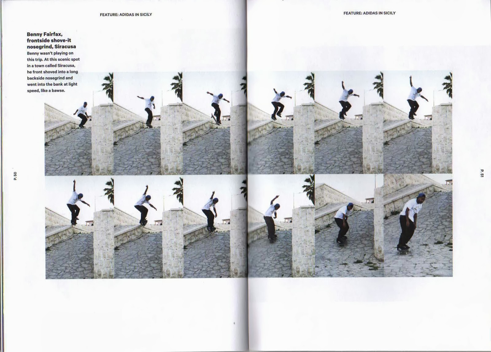
GREY SKATEBOARD MAGAZINE
The zine itself is produced and designed to a really high standard, it has a simple, effective design that focuses viewer attention on the photographs displayed. The zine is printed on a thick matt stock which gives the publication a quality feel that is only usually achieved by the more expensive magazines.
I managed to pick myself a copy of the magazine up from Welcome skate store in Leeds.


- These sequence shots are really effective at capturing the movement and the trick performed. As they are quite busy images the designer has placed them over a double page spread.

- The magazine focuses on skate photography, as this is what the audience want to see. Therefore, a lot of page space is taken up by imagery.

No.ZINE
Curation, illustration, design and art-direction by Patrick Fry with the help of many great contributors.


CREATIVE INDIVIDUALS
ANDREW GROVES
I first discovered groves' work in an issue of Huck magazine.


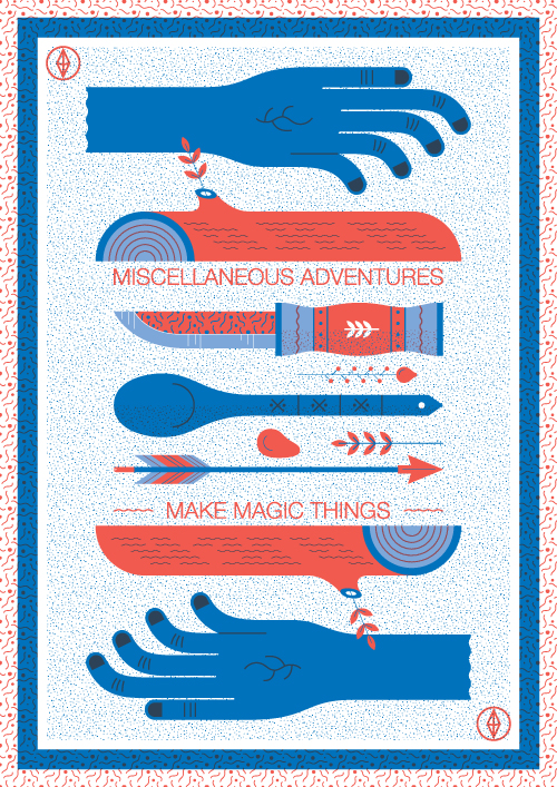
Below are some examples of the products available on the Miscellaneous Adventures website. All the items have been exquisitely carved by hand, and this is clearly reflected in their aesthetic quality and functionality.


Groves has also created some really effective company branding, the simple vector graphics are eye catching and reflect the nature influenced company ethos.


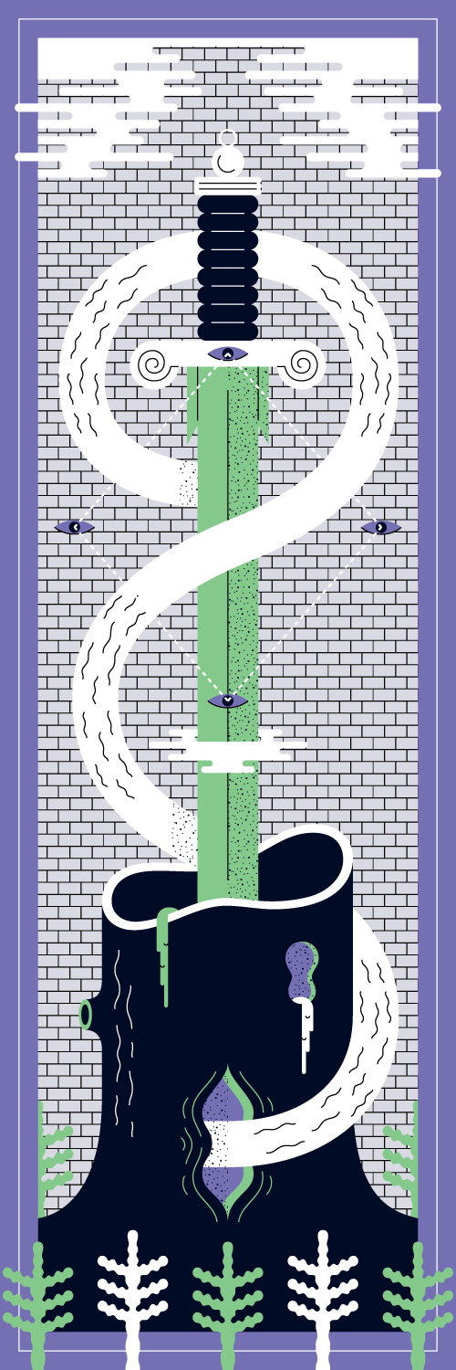
Below are some more examples of Grove's Illustrative work.


While browsing through Groves website I discovered some really inspirational work that caters specifically to my interests and taste. The skateboards were created to promote a new lynx fragrance called 'Excite', each design has been laser etched onto a blank deck to create some really original pieces.


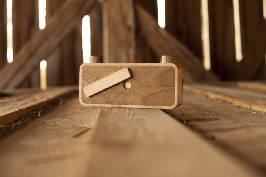
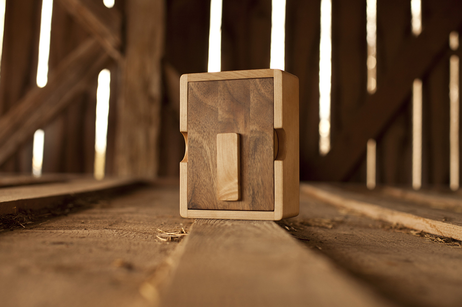
ONDU
ONDU is a craft driven design studio founded by Elvis Halilović, an industrial designer, photographer and carpenter. At the studio located in Slovenia, they use sustainable sources to create high quality hand made items such as wooden pinhole cameras and self-sustainable geodesic domes.
"We merge high level craftsmanship with functional and durable products that will bring the notion of intergenerational exchange of objects back into our lives."
Official Website - http://ondu.si

CAMERAS
While researching into ONDU I found a promotional video that showcases some of the design and production skill that goes into each camera. I really enjoyed watching the process each camera goes though as it highlights the skill and passion that goes into making each piece.
Below are some images of the beautifully crafted pinhole cameras that are created at the ONDU studio. Currently, society revolves around disposable items, including cameras, our world can only continue providing us with the resources to live this way for a certain amount of time. Meaning, that a change soon has to come, thi is not sustainable

135 Pocket Pinhole Camera

135 Panoramic Pinhole Camera
6x12 Multiformat Pinhole Camera

4x5 Pinhole Camera
Sliding Box Pinhole Camera
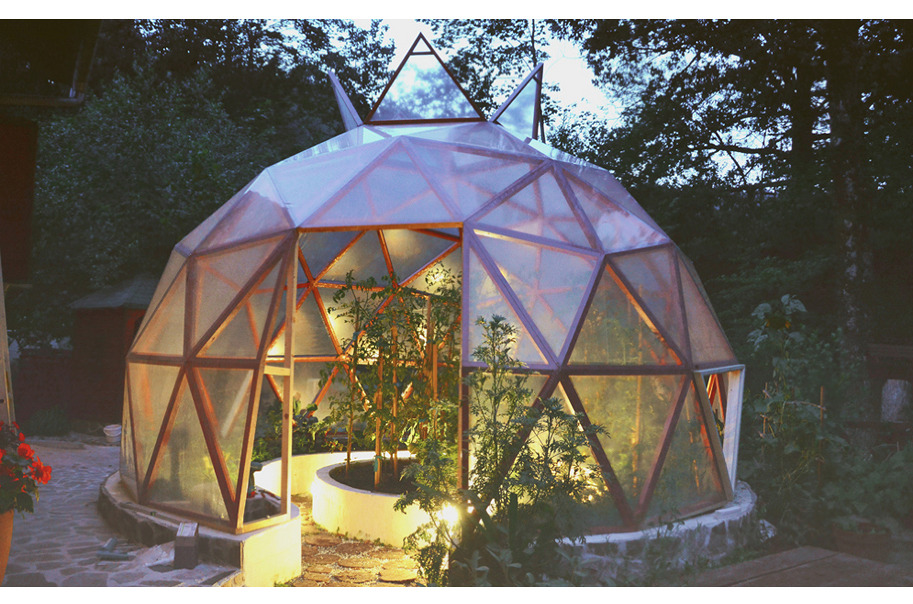
GEODESIC DOMES
ONDU also create Geodesic domes for various uses such as greenhouses and small living spaces. |To help keep the domes true to the sustainable company ethos each frames is manufactured using no steel, this means that they are joined using a combination of wooden screws and glue.

From a design point of view the domes are aesthetically pleasing, functional and sustainable. I believe it is these three aspects that captured my interest when looking at ONDU's work.


SKATEBOARDING
Finally, I focused on the D.I.Y side of skateboarding, this has always been part of the driving force that pushes the culture forward. Since the sports conception there has always been a D.I.Y ethos that has stuck with the sport, from skaters running their own small companies to building D.I.Y skate spots.
I want to focus my final section of research on the creative individuals who run their own companies and apply the D.I.Y frame of mind to their companies and products.

LOVENSKATE
Lovenskate is an east-London based skateboard company who hand produce zines and hand print t-shirts and skateboards. Printing decks this way is a dying trade as now or days most of the graphics are heat-transferred onto the board. However, Lovenskate screen-print each deck individually, giving each skateboard and individual, one of a kind look.
I find the Lovenskate company really inspiring as so much passion and effort goes into producing each piece of merchandise. Moreover, screen-printing and skateboards are both things that I personally find really interesting.

I first discovered Lovenskate through Huck magazine, artists and craftsmen are regularly featured in the 'Working Artisans Club' which is a section of the magazine that is devoted on exposing and praising the unsung heroes of the creative world.


Lovenskate also produce a zine which features articles and interviews and a selection of photography. The design of the zine reminds me of the early punk zines that I researched into earlier.
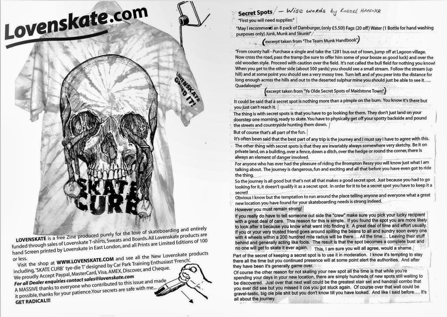


Below are some images displaying the graphic side of the company. Featured are company advertisements and examples of the illustrations that are hand printed onto each deck.


DL SKATEBOARDS
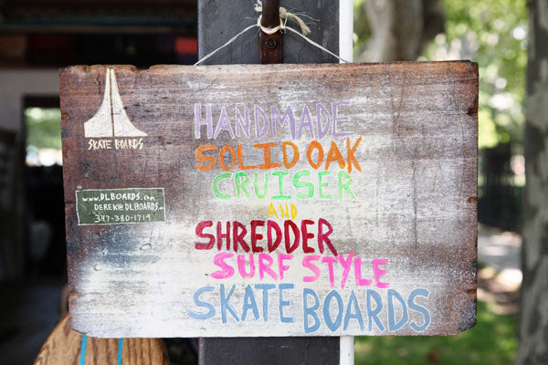
DL Skateboards is a small company based in the north of Los Angeles owned and run by Derek Mabra and Lauren Andino. The company makes hand-made 70's style cruisers using solid oak planks bought from a local timber merchant.
Each board is shaped and painted by hand, therefore each deck that is created is slightly different and individual from the last, this adds to the one of a kind feel that the company aim to achieve.
Below is a promotional video showing the production process each board undertakes.
Below are some examples of the DL skateboards products.


As a company DL skateboards haven't really focused on the graphic side of their company and instead have focused on their products. Therefore, company branding is very simple and consists only of a simple handwritten logo that can be found on the website.
The website itself reflects the hand-made ethos the company follows, its simple design puts the viewer focus on the products. Moreover, the primary font used is a hand written styled font, I believe this was chosen to reflect the nature of the company.
Although the website is successful I believe the company could really benefit from some proper branding.


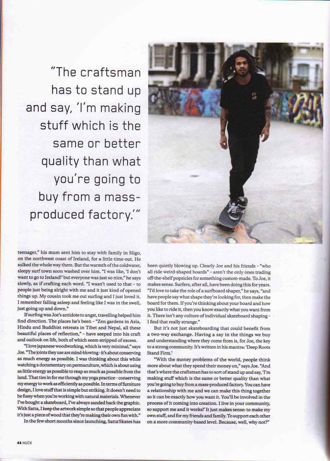
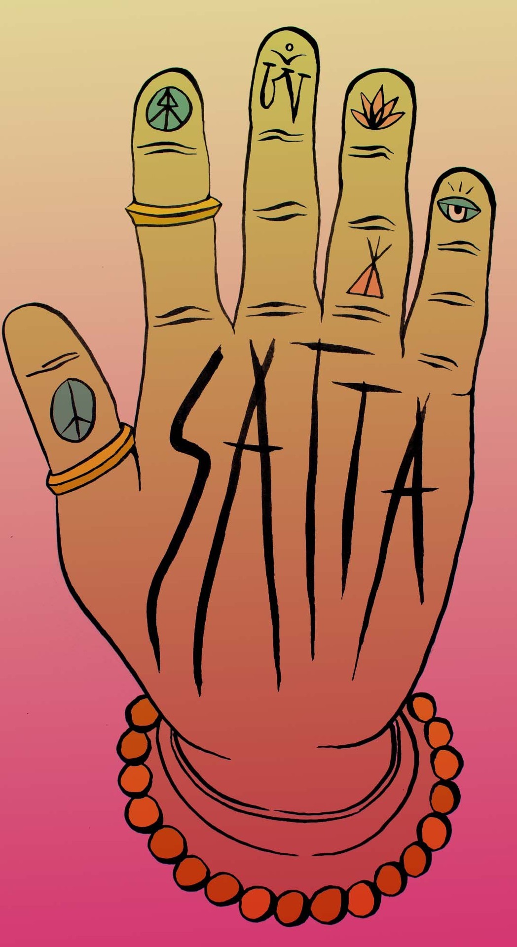
SATTA SKATES
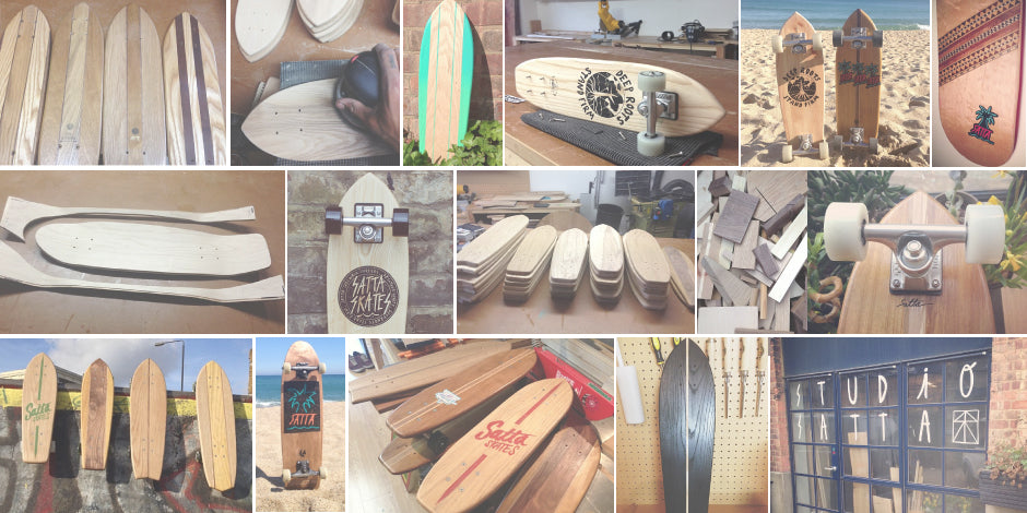
Satta skates is a London based skateboard company run by Joe Lauder. The company specializes in producing bespoke, 70's inspired hand made cruisers from wood off-cuts collected from the local saw mill. The decks produced are sustainable, and made to a standard that mainstream companies just cant match.

I initially discovered Satta Skates when reading Huck magazine, the company had a feature in 'The Working Artisans club'. After reading the article and researching further into the brand I became obsessed with the company and its products.


Below is a promotional video showing the production process each board undergoes.
Below are some of the boards available from the Satta Skates website.


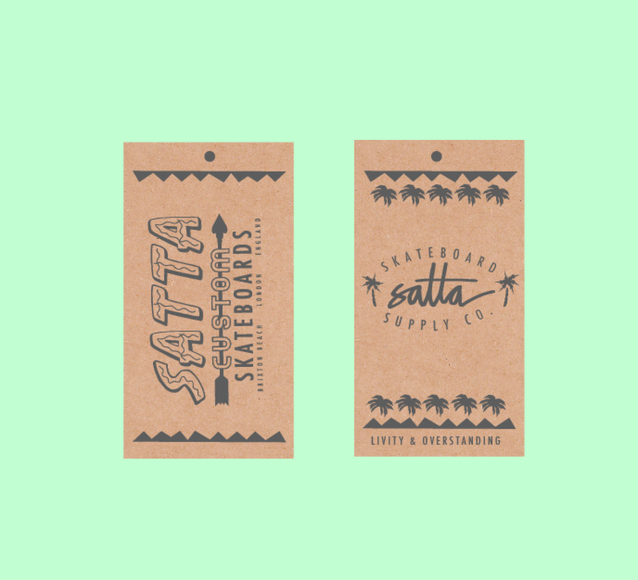
Next, I have featured some of the effective Satta Skates graphics. A range of graphics have been created to be used across the company for the decks, t-shirts, strickers and for the company branding. Many of the illustrations have a hand-rendered feel, I think is really effective as hand rendered graphics are relevant to the company ethos.
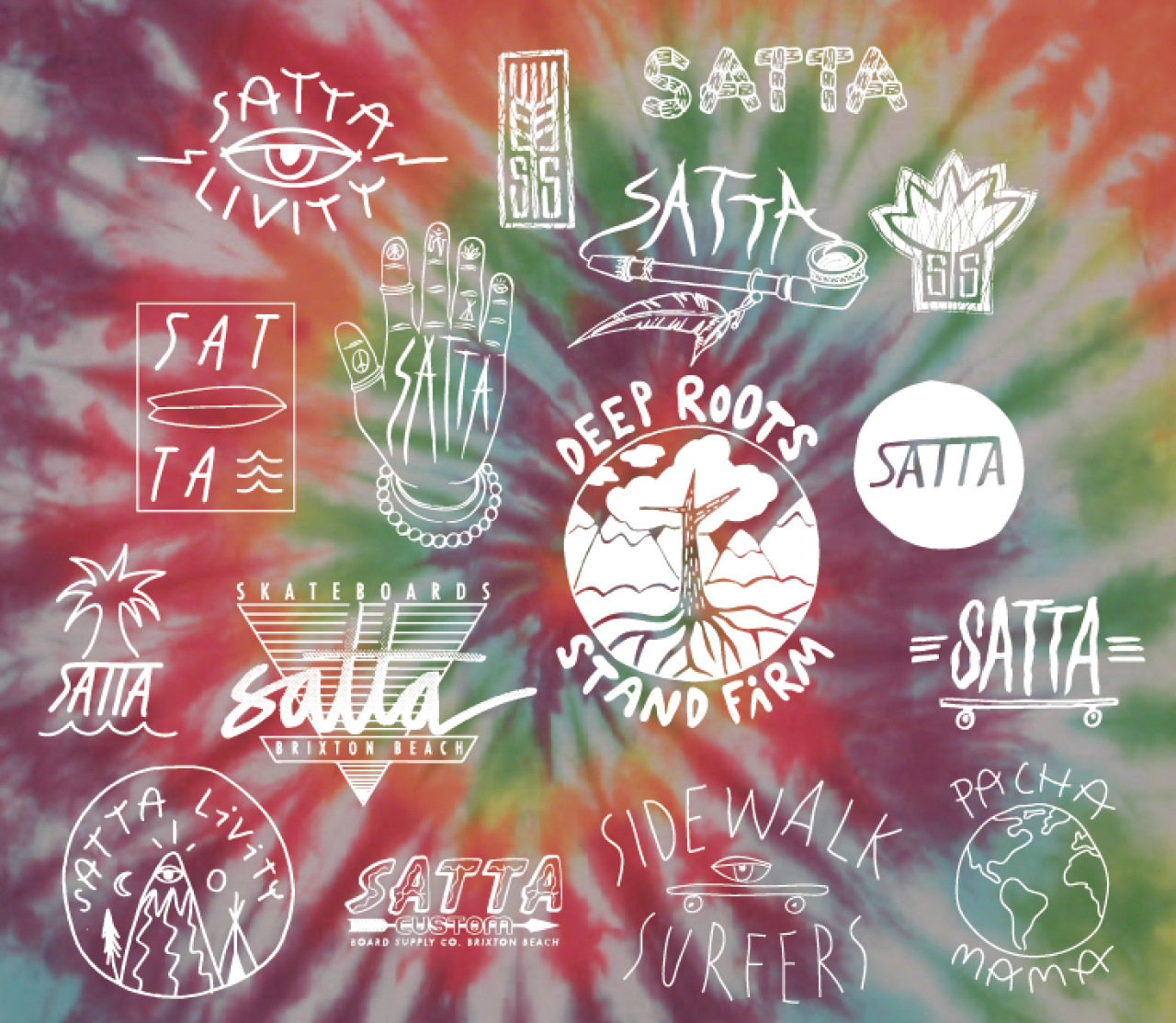


The symbolism in this design relates to Budhism and sacred geometry giving viewers an insight into some Joe Laurders inspiration and interests.
DRIFTWOOD SURFBOARDS
Driftwood Surfboards is a UK company set up in 2009 by David Forsyth. The company aim to make quality surfboards out of materials that are less damaging to the environment than conventional foam production methods. Therefore, Driftwood make their surfboards from wood that is either reclaimed or bought from a sustainable source.
It was the sustainable ethos that initially attracted me to the company, they put a lot of effort into ensuring that the materials used are not damaging to the environment and that no materials are wasted.
The company's ethos is built on three key principles, the three R's;
- Refined - Beautifully crafted, high quality products.
- Respectful - Conscious of the companies impact on the environment.
- Resourceful - Only environmentally friendly materials are used to construct the products.

Below are some of the products available on the website, each board is beautifully crafted, a work of art in itself and a real testament to British craftsmanship.


While browsing through the Driftwood blog I discovered this M.C Escher surfboard, created by the founder of the company David Forsyth.
The board takes inspiration from Escher's tessellation work that I looked at in my first research topic. The pattern is made up from over 2000 individual lizards, each with 24-carrot gold eyes, the results are breath taking.
The surfboard took a total of three months to create nd formed the centerpiece of the British Museum of Surfing’s latest exhibition ‘The Art of Surfing’. Moreover, the board was priced at £15,000 making it the most expensive surfboard in the world.


Finally, I looked at the graphic design side of the company.
The company logo (shown below) consists of a small tree icon within a circle, the icon makes for a good representative of the company as they are very environmentally aware. However, I think that improvements could be made to make the logo more specific to the company, as on its own it could easily be misconstrued for something else.

Some variations of the logo exclude the circle surrounding the tree and have type placed in various different compositions.


Lastly, I looked at the design and functionality of the Driftwood website.
Firstly, the website directs viewer attention to the various images placed on each page. As the company's success rides on the quality of their product it is very important that they have a set of high quality product images for the audience to see.
Moreover, navigating round the website is relatively easy due to the various tabs and linked images that direct the viewer.


No comments:
Post a Comment